Health insurance needs to feel effortless. With this persuasion, Pronova BKK will differentiate itself in the market of statutory health insurance funds in the face of future challenges.
As part of the strategic repositioning, the entire visual identity of Pronova BKK was given a makeover. All central contact points were redesigned and resolutely support the brand essence of "easiness". This involves the brand logo and the flexible design system emphasizing the digital experience.
Services:
Brand strategy, brand design, brand communication, brand experience, user interface, logo development, illustration kit, design templates, brand design portal

Strategy to experience
Based on four comprehensive design principles, the strategy was translated into a holistic brand experience. Each design principle captures the different requirements of the corresponding touch points.


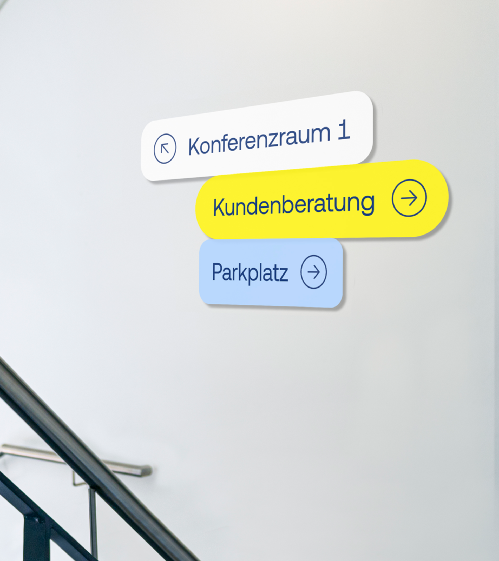
A sign of greater ease
The new brand unites trust and clarity. It communicates Pronova BKK's claim to more strongly position the needs of its customers at the centre of its brand marketing. The new brand creates a distinct and unique presence in all digital and analogue contexts.

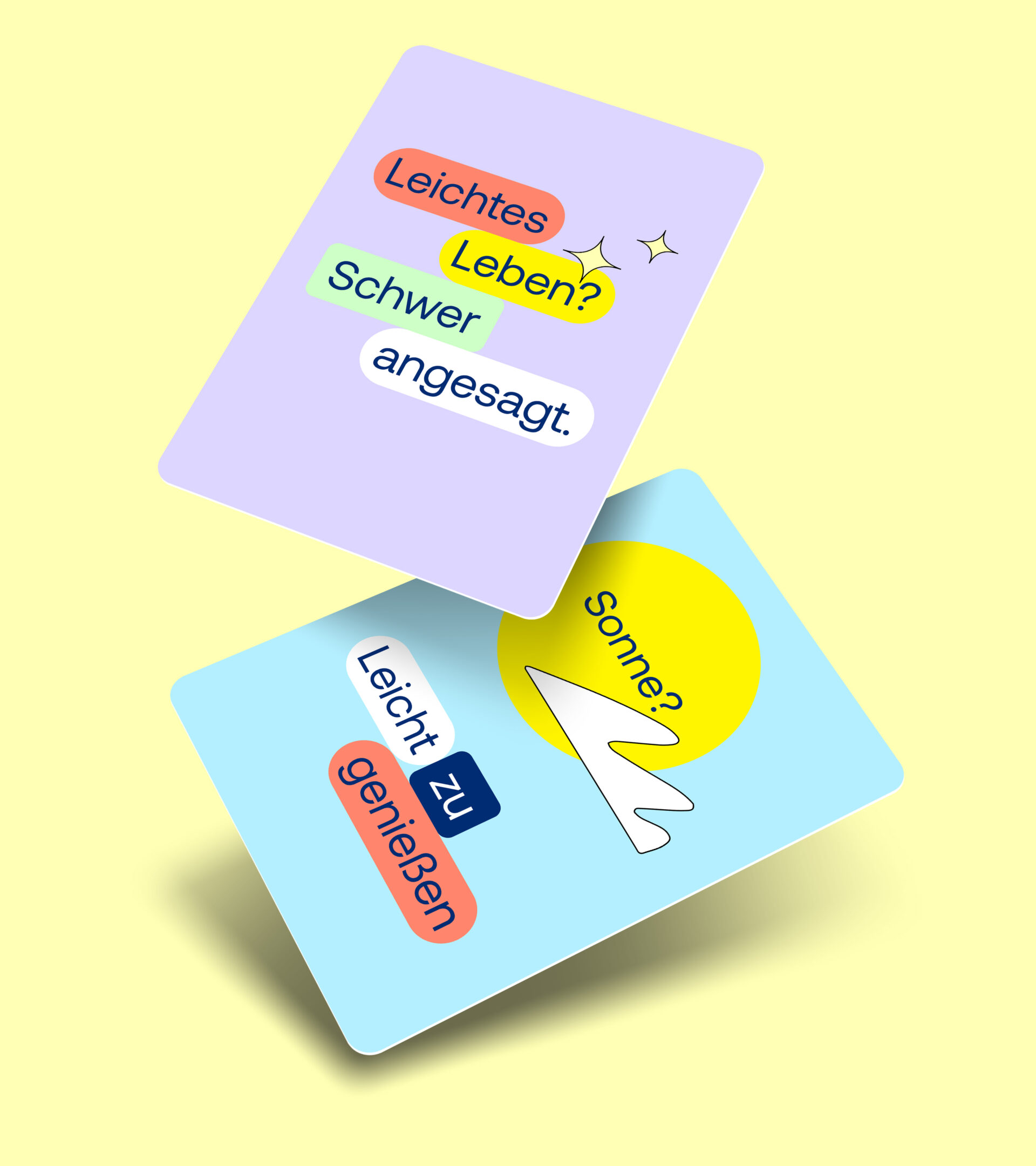
Concise and appealing
The new brand font of Pronova BKK is not only approachable and appealing due to its sweeping letter ends, but its open character allows complex content to be clearly and easily grasped with just a few font styles.


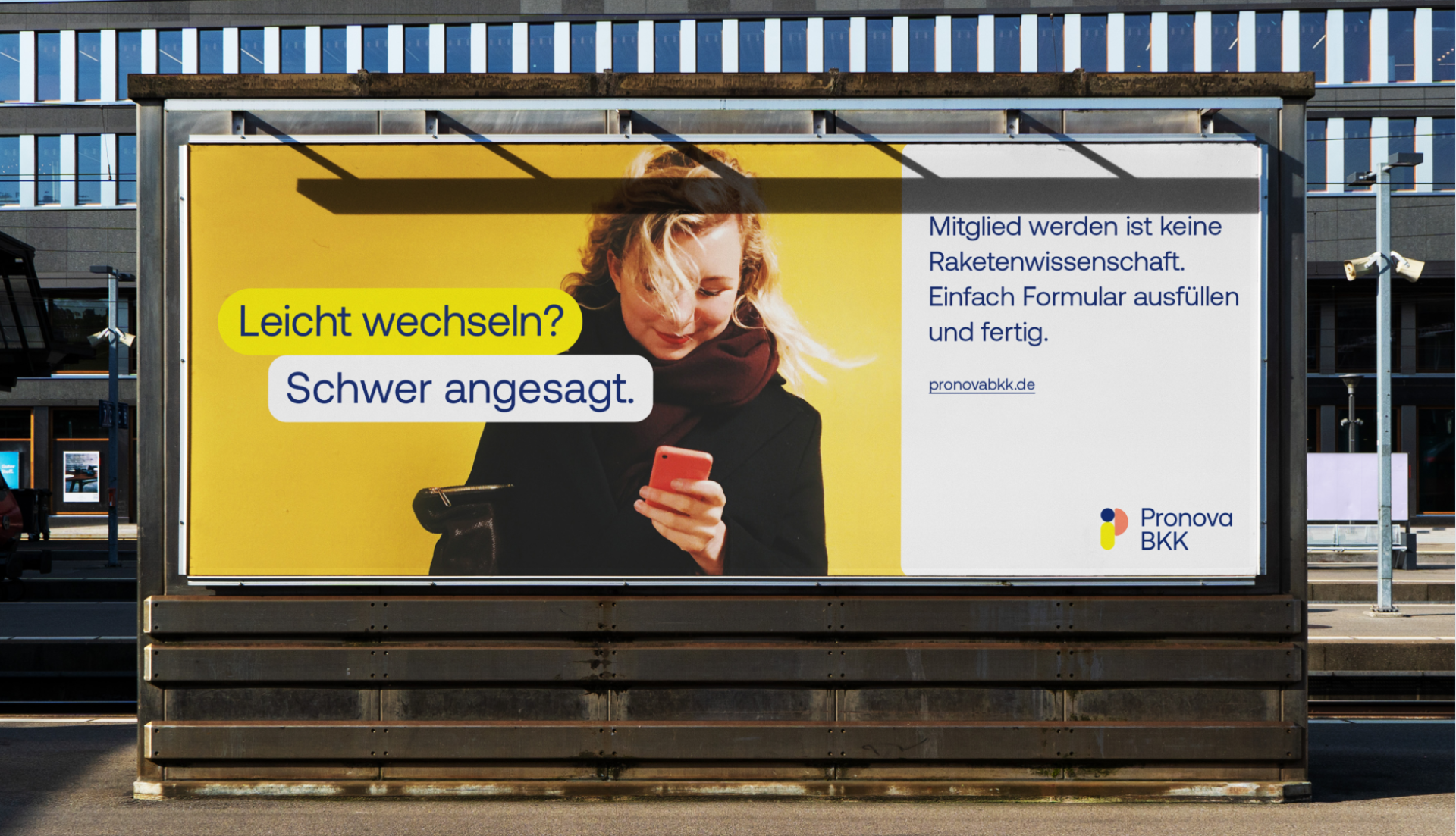
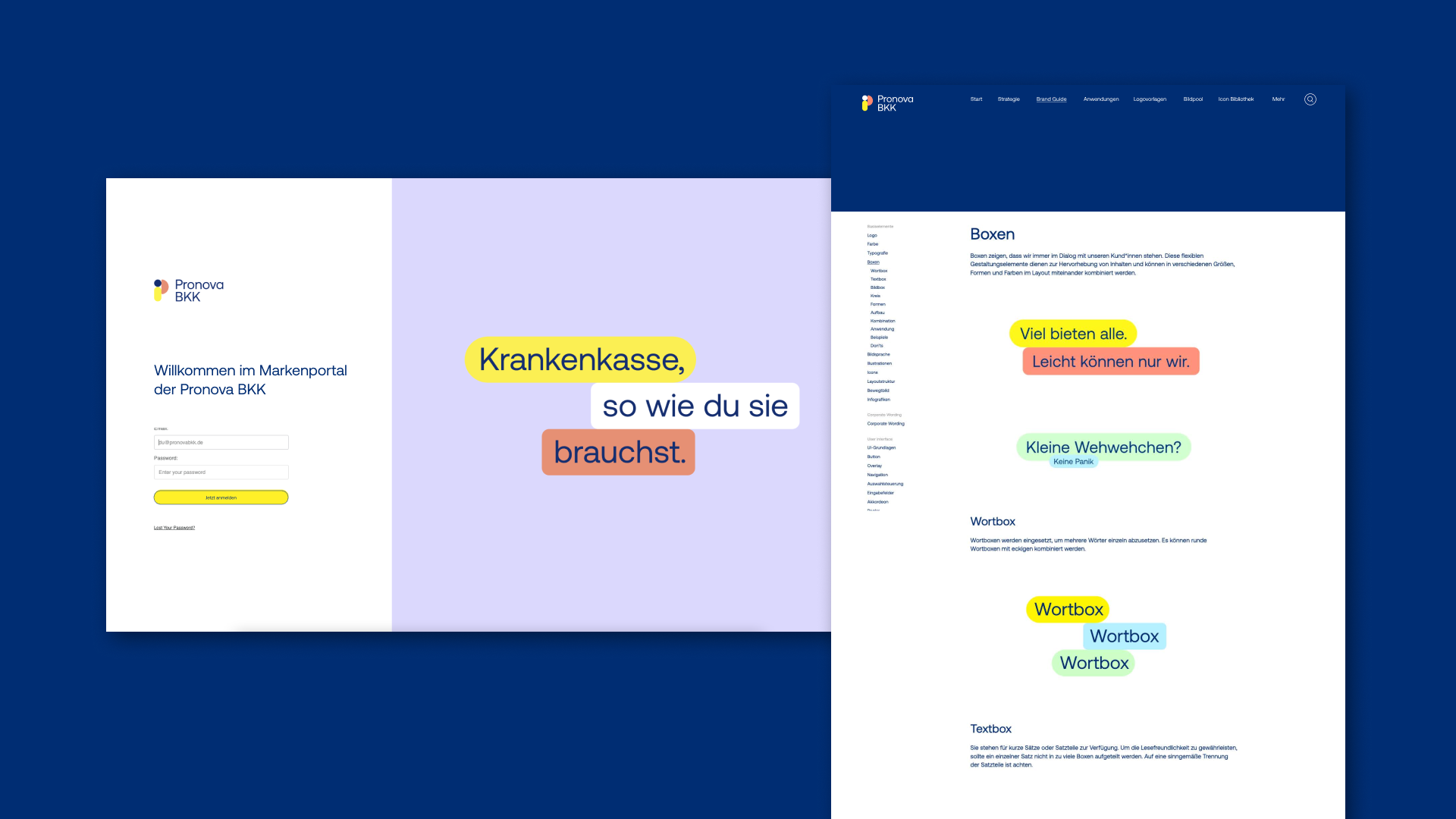
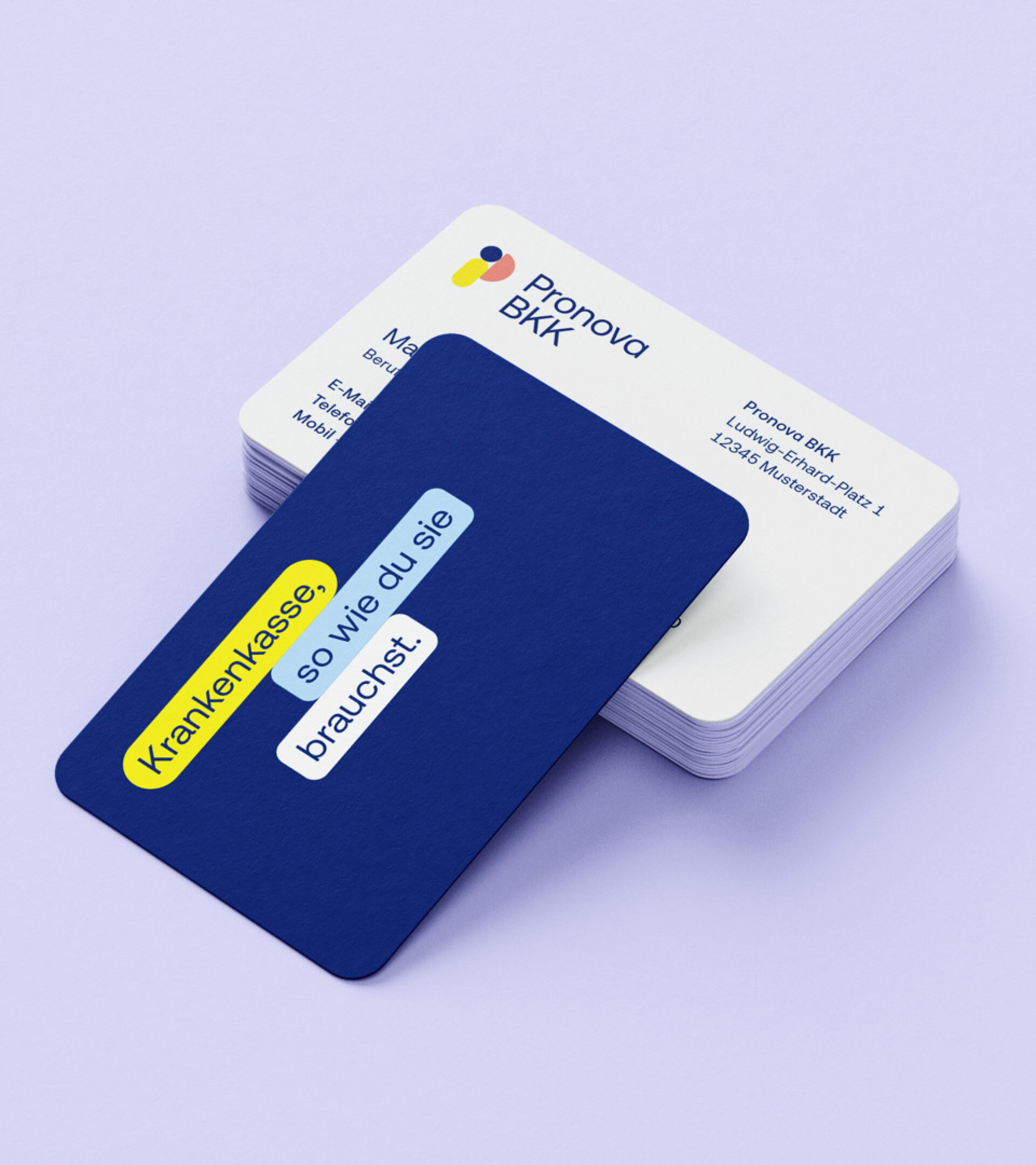
Listening and comprehending
Pronova BKK is always on hand for its customers, wherever they are. This connection is supported by the use of chat and dialogue boxes which thus become the core design elements of their visual appearance.
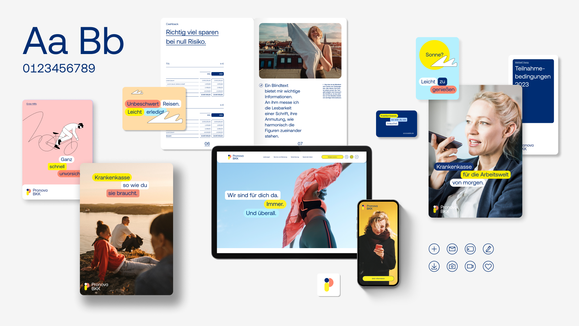


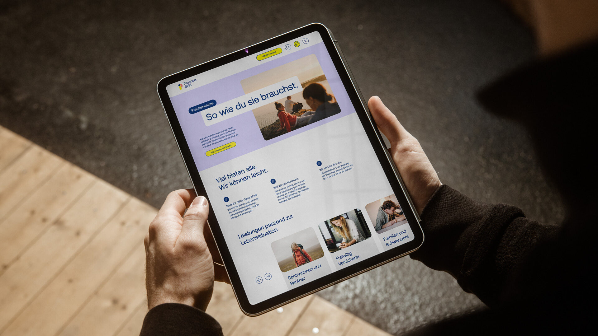
Digital first
All interactive elements, components and modules are derived from the basic design forms. This ensures coherent and consistent experience across all channels.


Available everywhere
All brand-related data, templates and information are stored in the digital brand portal. The new brand guide is the core framework for the application of the new appearance. The various design and marketing templates are available in the libraries for all staff and service providers.